THP Homes

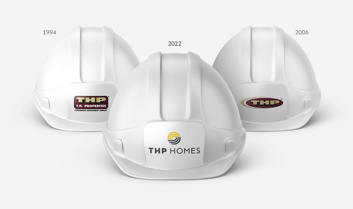
Our client, THP, was once named America’s Fastest-Growing Builder during their meteoric rise from that small builder we first met back in 1994. Fast forward to 2022 and once again THP is growing, adapting, and challenging the home building industry with its forward-thinking ideas and modern homes.


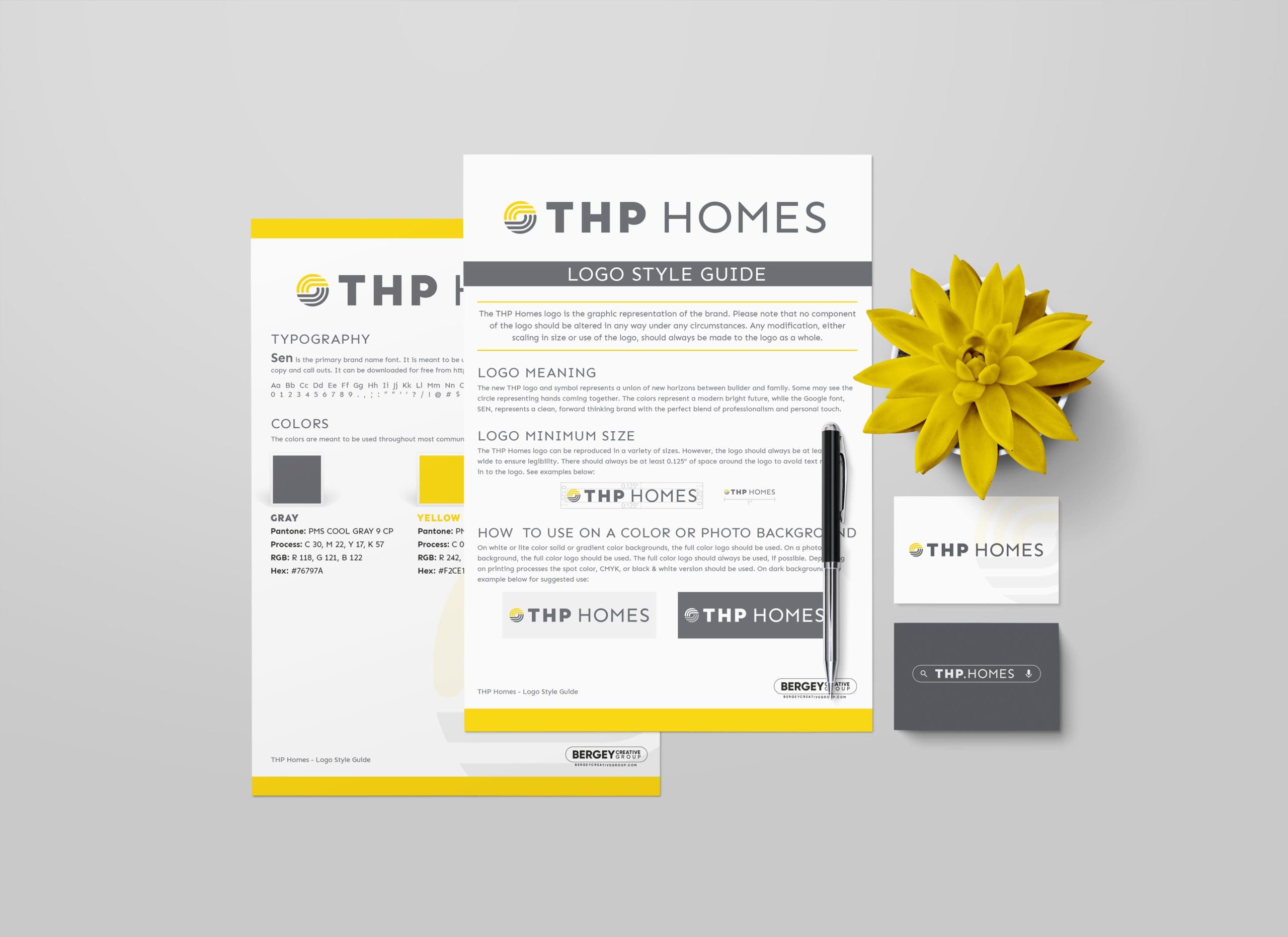
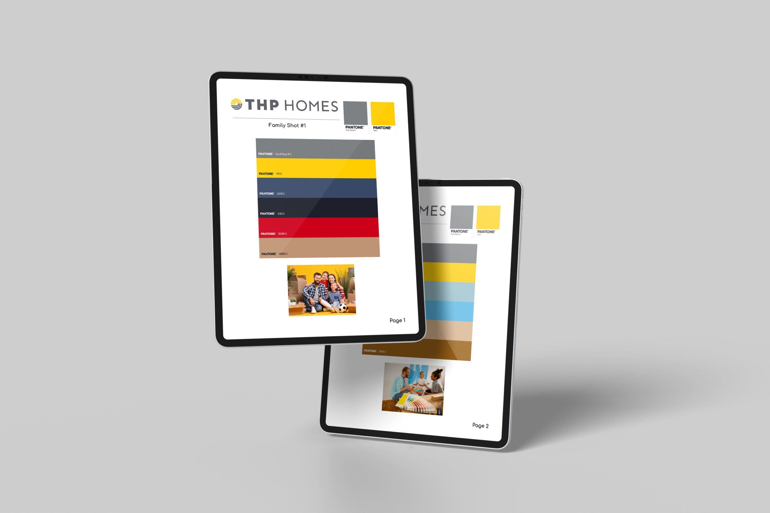
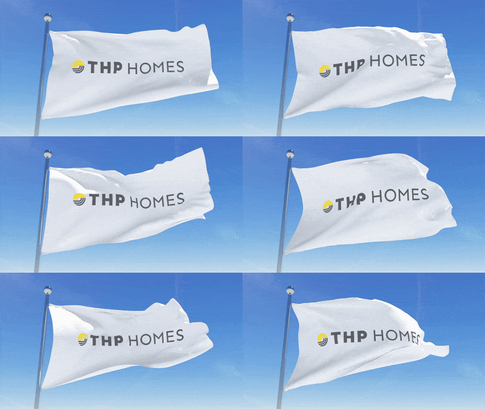
The new THP logo and symbol represent a union of new horizons between builder and family. Some may see the circle representing hands coming together. The colors represent a modern bright future, while the Google font, SEN, represents a clean, forward-thinking brand with the perfect blend of professionalism and personal touch.

![]()
This year THP Homes (fka T.H. Properties) decided to rebrand. Tom and his team’s project was to come up with a new logo. Due to the long history between BC Group and THP Homes, Tom was able to deliver a fresh new look to our brand, blending our past traditions with today’s Marketing constraints such as a logo that can be clearly read on a 6″ smartphone. We love the new colors (grey and yellow) of our brand and we look forward to using it everywhere we can.
Jérôme Besnard
Contact us

Are you interested in contacting Bergey Creative Group? We’re thrilled about that!

ADDRESS
672 Main Street, Suite G, Harleysville, PA 19438
PHONE
215-256-4512
HOURS
| Monday | 8:30 AM — 5:30 PM |
| Tuesday | 8:30 AM — 5:30 PM |
| Wednesday | 8:30 AM — 5:30 PM |
| Thursday | 8:30 AM — 5:30 PM |
| Friday | 8:30 AM — 5:30 PM |
| Saturday | Closed |
| Sunday | Closed |

